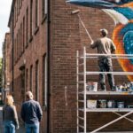

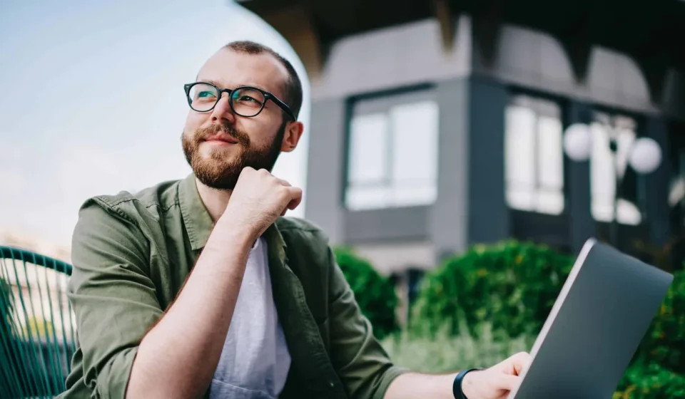

Image generated with AI. Art direction: Grafica.
The picture at the top of every post on this blog since 9 October was generated with AI, and each says so in the line under it: «Image generated with AI. Art direction: Grafica.» This is how we got there, the rules we keep, and what goes wrong.
From what is available to what we can imagine
Stock photography gives you what someone else already shot. For a blog that writes about specific things, an accessibility check, a backup that expires, a review before a handoff, the right picture often does not exist. You end up with a picture that is near the subject, and readers can tell.
A generated picture can show the exact moment a post is about. The question is whether it can do that and still look real, and stay honest.
The rules
- On our blog only. Client sites stay as written with each client.
- Always disclosed, in a line of text under the picture, not hidden in the file.
- Never a fake photograph of a real client: not their premises, their people or their product.
- No words in the picture. Text belongs in the page, where a screen reader can read it.
- People are invented, and nobody faces the camera. No recognisable person, brand, logo or place.
One system across every post
Every picture is written from the same frame, and the frame changed this week. Until 19 October it was a documentary photograph in daylight: pale rooms, black furniture, one violet garment and a plain blue mug as a signature. Sixteen pictures later they had become one picture: the same pale studio, the same two people, the same mug. My own note on this week’s drafts said it plainly: a back office that looked cheap, creased shirts, people reading stark white pages.
So the frame now rotates on purpose. Framing, setting, light and cast change from post to post. Clothes are pressed. When a screen is in the picture it shows a real page or a real report of ours, placed on it after the picture is generated, and the line under the picture says so. One blue-violet element carries the brand, a light or an object, never a logo on a shirt or a wall. Each scene is still chosen so that our reader, an agency or a business owner, sees his own day in it: a florist’s counter, a design studio at dusk, a library desk.
Five questions before a picture is used
- Can a stranger name the subject at once?
- Does it look photographed?
- Does it impress?
- Does it say design and technology, today?
- Would our client recognise his own day in it?
A picture has to pass all five. A good title on top of it does not rescue it.
What goes wrong
Quite a lot, which is why every picture is looked at, at full size, before it is used.
- Words creep in. This week a checklist sheet came back with part of a word legible on it. Rejected.
- Logos appear uninvited. In an earlier round a laptop lid came back with a maker’s mark on it, though the prompt asked for a plain lid. Rejected.
- Faces go wrong. This week one picture came back with a face smeared as if blurred after the fact. A reader would notice. Rejected.
- Some requests are refused. The model’s safety filter turned down two of our requests in an earlier round, and four this week, each with the one-word reason «other»; one of them asked for an empty meeting room. We do not reword a refused request: we write a different scene, or the post goes without that picture.
What this means for you
If you use generated pictures on your own site, decide your rules before the first one: where they may appear, how you disclose them, what they may never show. Then read every picture at full size, at the size your visitors will see it. The tool makes pictures quickly. Choosing which one is right is still the work.
If you want help setting that up for your own content, talk to us.
Gráfica built this survey as a WordPress plugin, and builds plugins like it for clients. Tell us what your site needs