



The first post in this series said that AI is the race car and a website still needs a driver. This is the second lap: Lux Corporación Legal, a law firm in Tegucigalpa. The site is live at luxcorporacion.com.
What a session built alone
An AI session, with no designer in the room, drew three concepts for the firm’s new website. Luis Gallego, Gráfica’s designer, chose the second, «The document»: a first screen and one section, set in two typefaces, with a small capital label over each heading and a framed list of institutions.
His first note on it:
«I like the layout but I’m still not impressed by this preview. Is it because it has no images yet?»
The session’s own answer was: partly. After the first screen, every section was the same ruled list on the same pale ground. Images would have hidden that, not fixed it.
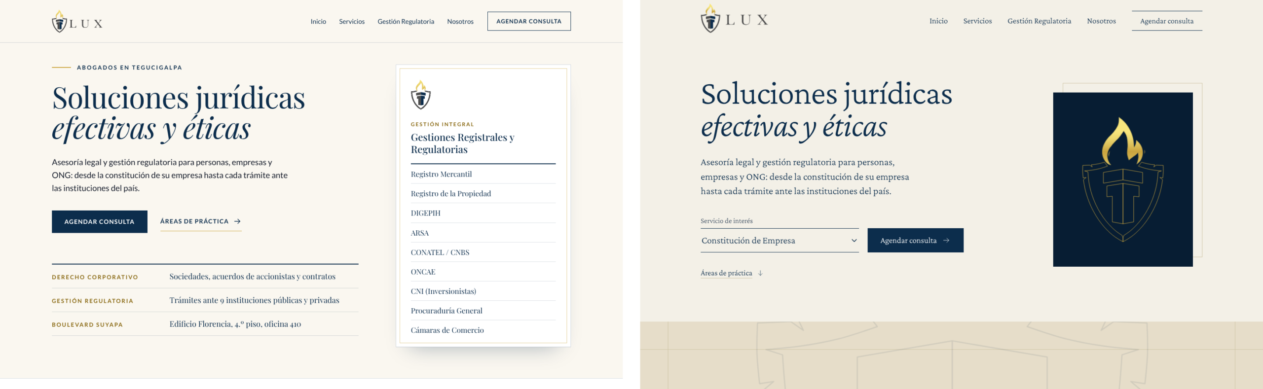
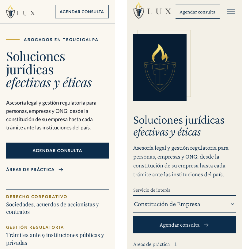
What direction changed
Five lists of notes followed between 11:09 and 13:56, and a sixth that evening, with the photographs. One named the yardstick, and it is his own: an editorial layout he designed earlier (behance.net/gallery/223700999/Editorial-Demo).
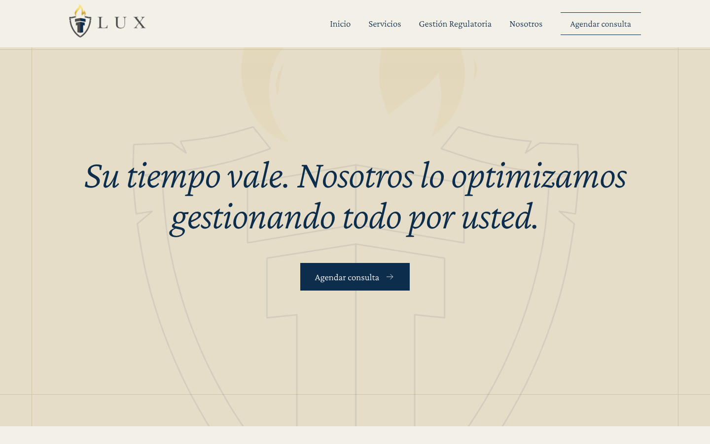
Layout. The note: «I don’t see any overlapping elements like those in the reference, nor any borders extending beyond where they should.» Before, each section sat inside its own box and no box touched another. Now a tan block runs off the right edge of the screen, a card sits over its corner, and thin lines cross and carry on past the point where they meet.
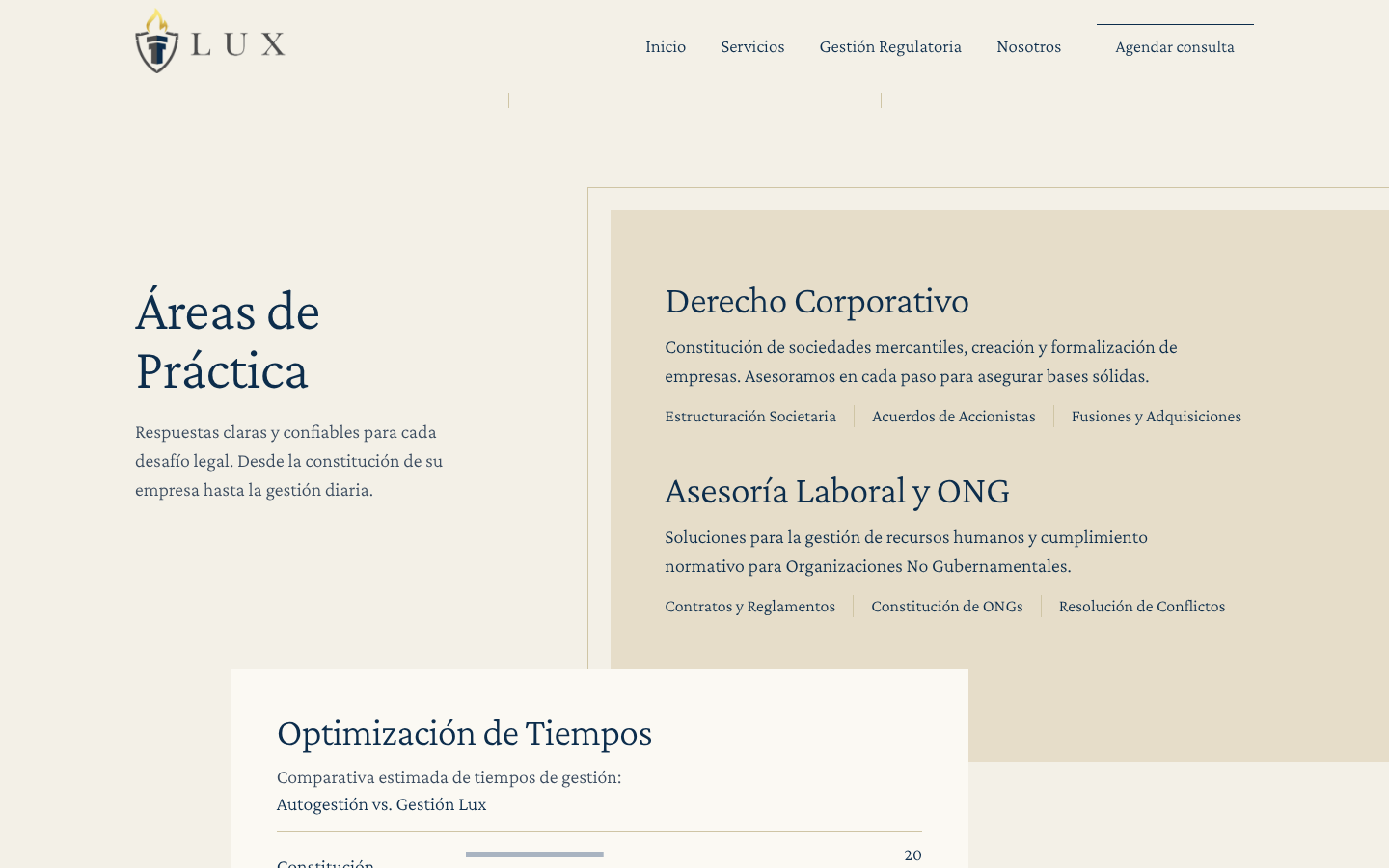
Photography. The reference leans on framed photographs, and the directed build had none: a frame stood empty where the picture would go. We had no photographs of the firm to work with, so Luis chose licensed stock over an empty frame. The session set the rules: no faces, one subject to a frame, two inks, navy and paper. Three places, three candidates each. Before he picked, a second AI session, asked only to criticise, said of the nine: «Not one frame contains anything that belongs to Lux.» He picked one per place: a column, a diagonal of window light, the city from a hill. The verdict stands for all three. Stock stands in.
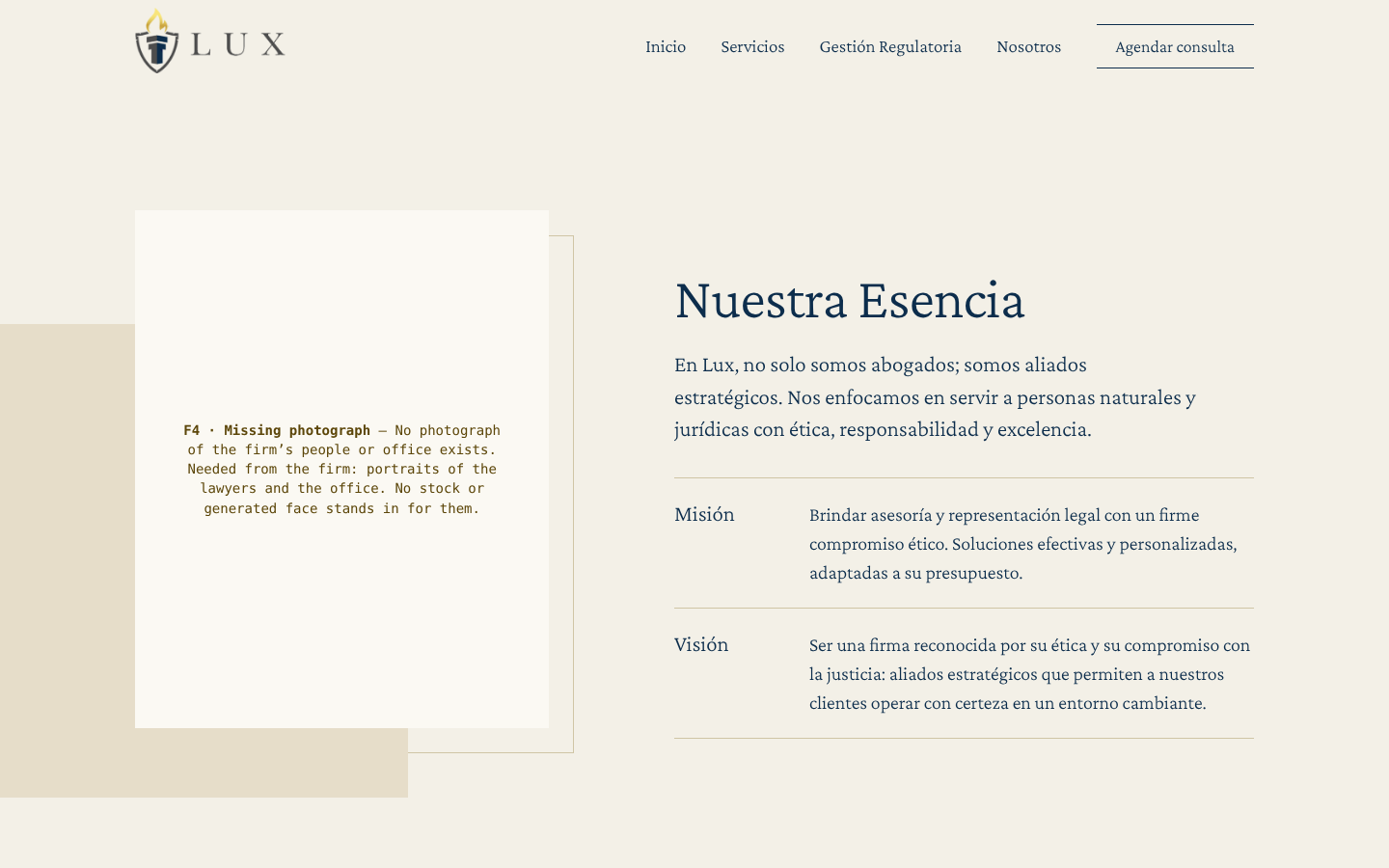
One section, divided. With the picks came one more note, on the About section, headed «Nuestra Esencia»: «Duplicate the Nosotros section, divide its content, alternate image and text positions, and use image 1 B.» Image 1 B was a candidate he had passed over, a pen’s nib. The section is now two blocks: the column beside the heading, then the firm’s mission and vision beside the nib. No word was added or removed. On a phone they stack as he wrote it: «image, text, image, text.»
Motion. The note: «It needs to be cleaner, inviting, include some interactivity, and encourage user action.» The first screen lost its list. In its place is one choice: the visitor picks a service, and the button carries that choice into the consultation form. A later note asked for «a parallax effect». The firm’s mark, drawn in line behind one sentence, now drifts as the page scrolls, and stays still for visitors who ask their device for less motion. A still picture cannot show that.
What came out
- The small labels over headings.
- Double frames and shadows.
- The second typeface.
- Every mention of WhatsApp on the pages a visitor sees.
- A dark band the session added on its own in round one. Two rounds later: «No dark sections.»
What a usable note looks like
None of the notes said «make it better». Each named a thing on the screen and what was wrong with it: a logo that, «due to an optical illusion, does not appear to be vertically centered»; a menu that changed the height of the bar when it opened.
The session acted on every list. It wrote none of them. We did not ask it to review its own build, so we do not say it could not; the second session reviewed only the photographs.
One update, one rebuild, one month: the numbers
The firm’s website was worked on twice in October, and the two pieces of work are not the same kind.
The first, on 1 October, was an update. It kept the site as it was, WordPress with a page builder, and changed what loads and in what order: the hero image converted and told to load first, the fonts served from the site itself, the first screen’s styles put into the page, a chart library held back until the chart is near. Google’s PageSpeed Insights, run on Google’s servers that day, gave the home page 73 for speed on a phone before and 94 after, with main content on screen at 6.1 seconds before and 2.9 after (medians of five runs each, 1 October 2026). That version of the site is still served at a staging address, and it is the one in the left column below.
The second, a rebuild, is the one this post is about: a new site, written as plain pages with no page builder and no database, directed as described above, live since 9 October.
We measured both on the same afternoon, 21 October 2026, with Lighthouse, the engine behind that same test, run from our own computer: three runs as a simulated phone and three as a desktop, alternating between the two sites. Middle values.
| WordPress, after the 1 October update | The new site | |
|---|---|---|
| Speed score, phone | 92 | 97 |
| Speed score, desktop | 98 | 99 |
| Main content on screen, phone | 3.4 s | 2.3 s |
| Main content on screen, desktop | 1.1 s | 0.8 s |
| First thing on screen, phone | 1.1 s | 1.9 s |
| First thing on screen, desktop | 0.4 s | 0.8 s |
| Page weight, phone | 525 KB | 194 KB |
| Page weight, desktop | 623 KB | 194 KB |
| Files requested, phone | 37 | 14 |
| Files requested, desktop | 37 | 14 |
| Accessibility score, phone | 93 | 100 |
| Accessibility score, desktop | 98 | 100 |

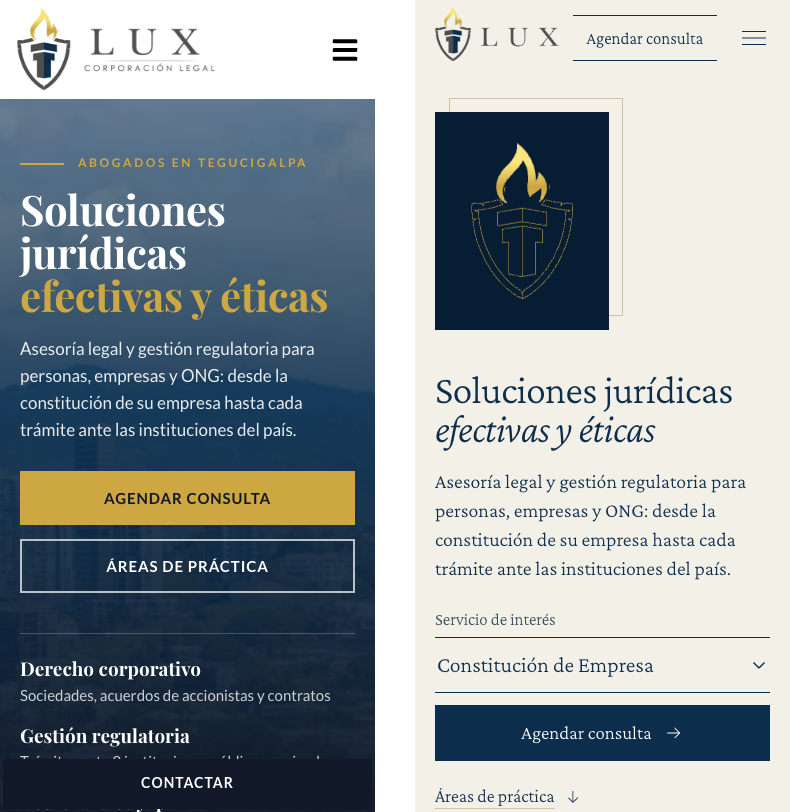
Lighter. The new home page sends about a third of the data on a phone (194 KB against 525 KB) and less than a third on a desktop, in 14 files where there were 37. Main content is on screen about a second sooner on the phone.
Not free. In the middle run, the first thing on screen appears later on the new site: 1.9 seconds against 1.1 on the phone, 0.8 against 0.4 on a desktop, and the runs overlap (the ranges are at the end). Its one stylesheet holds the page until it arrives (the test names it as render-blocking), and the first screen’s image is not told to load first. The WordPress site had its first-screen styles written into the page on 1 October, and that was not carried over. On the phone, the test’s measure of how fast the whole screen fills is also later on the new site in the middle run: 3.1 seconds against 2.4. Two things we have not done, listed again under «What we do not claim» so that nobody reads this table as a clean sweep.
Read the first row alone and the two sites are five points apart. The table compares an update with a rebuild; what the notes changed is in the pictures of the first part, and no score sees it.
What we do not claim
- One website, one designer, one day of direction. Both builds are our own work, and nothing here speaks for the firm.
- The pictures in the first part are ours, rendered from copies of both builds at 1,440 and 375 pixels wide, before the photographs. The two pictures in the numbers section are the two addresses as served on 21 October 2026: the WordPress site at its staging address, after our update of 1 October, and the new site at luxcorporacion.com.
- The photographs are licensed stock, not the firm’s.
- Nothing here is about visitors, enquiries or clients.
- The WordPress site in the table is not the firm’s original site. It is that site after our own update of 1 October; the original was not measured by this method and is not pictured here.
- The 1 October figures and the 21 October figures come from different runs of Google’s test, three weeks apart, the first from Google’s servers and the second from our machine. They are reported side by side, not subtracted from each other.
- The numbers compare an update with a rebuild. They do not measure the notes.
- On the phone, two figures are worse on the new site in the middle run: the first thing on screen (1.9 s against 1.1 s) and how fast the whole screen fills (3.1 s against 2.4 s). Two things we have not done: its stylesheet blocks the page until it arrives, where the 1 October update wrote the first-screen styles into the page; and its first-screen image is not told to load first.
- That the directed build is better is our judgment.
Before you hand anyone the keys
- Ask to see the first build. A good answer is a picture.
- Ask for the notes in the reviewer’s own words. Good notes name things; weak ones name feelings.
- Ask what was taken out, including what the tool added unasked.
- Ask for the numbers before and after, and which ones got worse.
- Ask what is still unfinished. «Nothing» is the answer to doubt.
Building or rebuilding this year? Talk to us: grafica.group.
How we measured
Lighthouse 13.5, the engine behind Google’s PageSpeed Insights, run from our own computer in a headless Chrome with the test’s standard simulated phone (a mid-range device on a slow 4G connection) and desktop settings. Both home pages, first load, before scrolling. Twelve runs between 21:27 and 21:30 UTC on 21 October 2026 (3:27 to 3:30 p.m. in Tegucigalpa): phone, then desktop, WordPress then the new site, three times over. The table holds the middle value of each three. Simulated tests, not real visitors. 1 KB is 1,000 bytes. Page weight is the test’s total byte weight; files requested are the test’s network requests.
The 1 October figures are from Google PageSpeed Insights run on Google’s servers that day, medians of five runs on the live address at the time; they are quoted from our own record of that work.
Ranges behind the middle values, phone: speed score 79 to 92 on WordPress (the first run of the afternoon was its slowest) and 93 to 100 on the new site; main content on screen 3.3 to 4.5 seconds against 1.5 to 2.4; first thing on screen 1.1 to 1.7 against 0.9 to 1.9; whole screen filled 2.1 to 5.5 against 1.6 to 4.6. Desktop: speed score 97 to 98 against 99 to 100; main content 1.0 to 1.1 seconds against 0.4 to 0.8; first thing on screen 0.4 in all three WordPress runs against 0.3 to 0.8. Seconds are rounded to one decimal (0.45 reads as 0.4 because the run was 0.4499).
Also in the runs and not in the table: the WordPress staging copy asks search engines not to index it, so the test’s search score for it (69) is a property of the staging address, not of the site, and is left out. Its accessibility findings were a heading out of order and, on the phone, a link without a name.
Gráfica built this survey as a WordPress plugin, and builds plugins like it for clients. Tell us what your site needs